Five Biggest Flaws of iOS 7
The launch of new iOS-7 has created much hype in the market for many reasons. Being the apple product and following the trend of apple’s I-phone series, the expectation meter was raised to a much higher degree from the fans of apple users. Apple’s operating system was launched on the second week of September has positive as well as many negative feedbacks to it. Let’s review the phone for a better understanding of it.
What went wrong with iOS – 7?
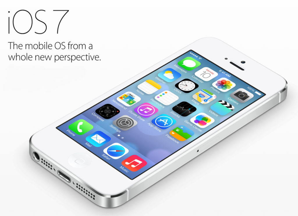
The phone is in praise amongst its users for an upgraded looking design, the automatic updates of the applications and an improved mailing facility. But these trivial improvements can’t cover up for the flaws that the iOS 7 contains.
Unimpressive Design
A lot of people have found the new design of iOS 7 to be ordinary and unimpressive that’s because it’s not completely re-designed. The design is incomplete for the fact that upon opening the applications like Podcasts,iBooks or Findmyfriends, the user is going to experience the same design as in iOS 6 which makes iOS 7 the same phone with a ‘cliché tag’ of having a new experience in it.
Slow Animation
Users have complained of iOS 7 having the slow animation experience as compared to the previous iOS series. The opening and closing of the applications take much longer time than usual and the browsing thereby becomes a slow experience leading to a slow animation on screen. The tapping of button on screen, hence, becomes a difficult task.
Difficult Settings
The new translucent setting of the touchscreen of the phone makes it difficult for the user to notice the phone clearly. Moreover, the popping of wallpaper creates a rather unmatched complexity to the whole screen avoiding the simplicity and clarity for which is apple is otherwise known for. Calendar is now just a white grid; the same with reminders and notes; contacts too has occupied a vacant white space which gives a different feeling of using a difficult phone. The new buttons look like text links on the web might make web users difficult to use it, the new location for spotlight also can frustrate the users who are used to having it in particular place. These baseless changes have further made using iOS 7 a much complex phone.
No space for innovation
After using iOS 7 for a while, it begins to feel familiar to other IOS series phone. The user actually feels like going back to using the previous iOS. The design is also the same with other application which concludes the fact that it hasn’t been designed to give a newly innovated way of using the technology.
Lack of Game features
For game lovers on iOS, the phone lacks the feature of having to see online friends, effective ways of communicating with them. The game center hasn’t come up with good games which one can get hooked to. Clearly, enough iOS 7 lacks creativity in all the aspects which is it’s biggest flaw.


